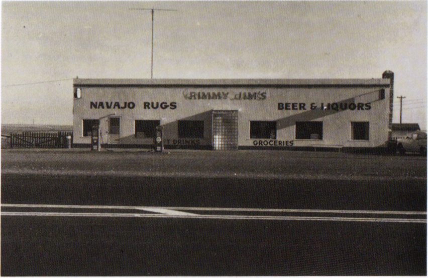
Ed Ruscha – Rimmy Jim’s Chevron, Rimmy Jim’s, Arizona 1962 from 26 Gasoline Stations
Time and again in discussions of Ed Ruscha’s photographic work one comes across (in addition to its usual stowing in a box labelled ‘conceptual’) expressions like deadpan, boring, amateur, flat, affectless. In Jeff Wall’s much vaunted article Marks of Indifference (which, I’m sure not intentionally, has helped pave the way for the legitimisation of a species of art photography which seems to be based on cost of making and yardage) he rather snottily talks of how amusingly bad the images of one of Ruscha’s early photo series are:
“…the majority seem to take pleasure in a rigorous display of generic lapses: improper relation of lenses to subject distances, insensitivity to time of day and quality of light, excessively functional cropping, with abrupt excisions of peripheral objects, lack of attention to the specific character of the moment being depicted – all in all a hilarious performance, an almost sinister mimicry of the way “people” make images of the dwellings in which they are involved …”
In a sort of reply to this, I’ll confine myself to a single image from the series, entitled, rather splendidly, Rimmy Jim’s Chevron, Rimmy Jim’s, Arizona 1962.
It is a wonderful study in horizontal lines and a kind of poetic deviation therefrom. The white lines on the road in the foreground, the change of texture marking the threshold of the garage forecourt, the blockhouse type building itself and the neat tops and bottoms of windows, porch, petrol pumps, litter bin and what appears to be a bench; and the lines of text (and there’s an obvious but nonetheless real frisson to be had here in light of Ruscha’s later work.) The three cross bars of aerials or telegraph poles, one atop the building in the middle left foreground and two lovely and delicate echoes in the far right middle ground and just visible at far left, way back in the distance. The horizon at far left and the roof of the outbuilding, then, bridging the gap between horizontality and something else—the ‘serrated’ top edges of the gates at both ends.
And in a kind of visual counterpoint, those angled lines—the telegraph wires rising up and out at right and the single cable leading downwards at left. More pronounced, the long morning (or evening) shadows across the main building and the thick short white diagonal connecting the two road lines.
A diagonal extrudes into the z-axis with the car parked outwards towards the road, with the photo’s unique curve (if one excludes the hardly discernible, perhaps imagined, one of the litter bin), the arc of the car roof.
Finally—it seems to me that the whole photo tilts slightly to the right. Whereas some might find evidence here of incompetence, bad photography, I choose to
(I’m not even sure I choose to, I simply do; something in my formation, my time and place, disposes me to this) receive this as rescuing the photo from over-schematicism. The tilt both reminds us of human agency at work and contributes to the stew of formal interest around line.
I choose to find it not bad but human. I choose to find it an element of a new kind of good and I choose to argue that point, to make it part of a discussion in the world about images, art in general and what it is and what it does.
Michael Szpakowski


