Bill Dane: ‘Vision from Victory by J. Conrad’

Bill Dane   Vision from Victory by J.Conrad
Acrylic on Canvas   1964   20.5 X 26.5″   (Click for a larger view)

Editor’s note:
I reproduce this marvellous 1964 painting by the eminent photographer Bill Dane as an example of ‘Reverse Ekphrasis’. I coined* this term informally to comment on the painting elsewhere and a subsequent exchange led me to consider: ‘In what way would ‘reverse Ekphrasis’ differ from ‘Illustration’ – why complicate matters?
My answer is that Bill’s painting transcends illustration in the same way that the best Ekphrastic writing transcends simple description – it has qualities and dimensions all its own which supplement and develop at the highest level its subject – ‘Victory – an Island Tale’ the rich, odd, flawed late novel by Joseph Conrad.

*So I did, before a quick Googling revealed I’m far from the first to do so, although the sense of its use varies widely…

The Making of a Fresco Showing the Building of a City

This is Diego Rivera’s mural The Making of a Fresco Showing the Building of a City. Completed in a month in May 1931, it is in the San Francisco Art Institute. You can just walk in off the (very steep – this is San Francisco) street to see it (800 Chestnut Street, 9am to 7pm). That makes it probably the most accessible of Rivera’s murals for this project’s readership – most of whom, I guess, are more likely to make it to San Francisco than to Mexico City or Detroit.
Art history hasn’t been entirely fair to Rivera. When the story of modern art was seen as the shining path to abstract expressionism, Rivera together with Jose Clemente Orozco and David A Siqueiros, the other ‘big three’ great Mexican muralists, were often conveniently left out as being ‘social realists’ and too concerned with politics. More recently he is often assigned (probably unjustly) an inglorious bit-part as Frida Kahlo’s feckless other half.
Rivera is also not well served by art museums, though you can find plenty of his works there. Before his murals he spent more than a decade in Europe (1907 to 1921) and became an accomplished modernist (particularly cubist), but also missed the Mexican Revolution (1910-20) he later did so much to celebrate. During his international glory days in the 1930s he did some great portraits (including one of Edsel Ford, who also commissioned magnificent Rivera murals in Detroit). And he painted numerous pictures of Mexican popular life, most famously flower sellers (personally I find these a bit on the sentimental side). The problem is that easel paintings, however good, don’t do justice to Rivera’s extraordinary talents. To really experience them you have to see the murals – and walls, by and large, don’t travel.
Making of a Fresco isn’t by any means the biggest of them – Rivera complained that the wall offered to him was ‘a small one of only 36 square metres’ (in fact the total area of the finished mural is 43.2 square metres) ‘not at all suitable to my purpose, which was to present a dynamic concerto of construction – technicians, planners and artists working together to create a modern edifice’.
But it is easily big enough to see what makes Rivera so good. First there is the way he fills the space – not a square centimetre wasted – with absorbing and utterly comprehensible interlocking narratives. Then there is the way he deals so easily with modern life – socially but always preserving individuality. The big bum on the trestle in the middle obviously belongs to Rivera himself, but the other painters with their backs to us are his assistants – Matthew Barnes on his right; John Hastings next floor of scaffolding down on his left; and in the lower panel on the right, hard at work at the trestle table, the trio of designer Michael Goodman, Art Institute lecturer Geraldine Colby Fricke and engineer Alfred Barrows. Rivera’s hugely distinctive work applies all sorts of techniques and ideas from the Renaissance, from his use of fresco (paint applied to wet plaster) to the prominently featured ‘donors’ reminiscent of so many fifteenth and sixteenth century European religious paintings – in this case the hatted and suited trio examining plans, Timothy Pflueger, the architect who invited Rivera to San Francisco to paint a mural in the stock exchange, William Gerstle the chairman of the San Francisco Art Commission who commissioned the Art Institute mural, and Arthur Brown architect of the Institute.
And finally, there is Rivera’s ability to master a commission, while still maintaining his own, social and political concerns. This is a mural for an art school, so it is a fresco about making a fresco. It is a mural in a dynamic North American city of the 1930s, so it is about design and construction in such a city. But alongside that it celebrates the dignity of workers by hand and by brain.
Generally, Rivera got away with it – with satisfied patrons including Edsel Ford and the Mexican government. Once, famously, he didn’t, when Nelson Rockefeller discovered that Rivera’s Man at the Crossroads for the new Rockefeller Centre in Manhattan included a portrait of Lenin. Rockefeller promptly paid Rivera off and – to the eternal loss of New Yorkers – a year later destroyed the not-quite completed fresco. When Rivera re-created the work the following year at the Palacio de Bellas Artes in Mexico City, Lenin was firmly there, this time alongside Trotsky and his call to create a Fourth International.
If Making of a Fresco whets your appetite, and I am sure it will, then half an hour’s drive away and a bit off the tourist track at City College of San Francisco (50 Phelan Avenue, check opening times but probably 10am to 4pm Mon to Sat in term time), is another, bigger and altogether wilder Rivera mural. Pan American Unity: The Marriage of the Artistic Expression of the North and South of the Continent was painted for the 1939-1940 International Golden Gate Exposition in San Francisco. Across ten panels and covering a total of 175 square metres every aspect of the title, and more, is explored: from the recently constructed Bay Bridge to pre-Conquest Aztec craftsmen and women; Simon Bolivar alongside Abraham Lincoln; Charlie Chaplin and Frank Lloyd Wright; the murderous trio of Stalin, Hitler and Mussolini; and a statuesque Frida Kahlo ( who remarried Rivera in 1940 in San Francisco) rather curiously standing right in front of Rivera himself, who has his back to her and is holding hands with the Hollywood star Paulette Godard.
And if Pan American Unity whets your appetite even more, there are of course flights to Detroit, and a few days holiday in Mexico City to be planned.

Peter Goodwin

A Drawing by Richard Serra

Richard Serra Elevational Weights, Black Matter 2010 paintstick on handmade paper 82 × 68″

On your screen is….
a photograph…
….of a printed image in a book
…which itself is a photograph of the drawing.
The absence of any detail and referential elements leave us looking but not really seeing and actually, the more you look the less you see. You see, what you need to really see is just not there.
It’s the same with the endless reproductions on tea towels, biscuit tins and laptop sleeves of iconic works such as Van Gogh’s Sunflowers. We’ve looked at it of course, in all its guises. It’s instantly recognisable, but probably rarely really seen.
If you get to really see this work by Richard Serra you’ll notice that it’s large, at 82 x 68 inches, and in its own way as monumental as his sculptural works. Standing in front of it, it’s so much more than just a black rectangle and it plays with your perceptions every bit as much as his sculptures.
It’s a drawing on handmade paper so there is the texture of the paper showing in places. It’s made with paintsticks held together to produce a block for covering areas in a sweep. So there are distinct strokes and also a lot of variation in texture and depth. The paintsticks produce a surface which seems to play with the light, both absorbing it and reflecting it. It has a real feeling of depth and volume and earns its title.
I’ve never seen black as a negation of colour, or negative in some way. Because it contains all the colours its feels complete and one can spend time just being with it, understanding it and being excited by its possibilities. Its all there. It always was, maybe we just couldn’t see it.

Keron Beattie

Papers in a Striped Brown Paper Bag

1

The brown certificate with its notices and crossings-out
its crisp fonts and faded signatures
Dutch, not French ‒ we knew this ‒
words waiting for translation
safely folded inside a striped, brown
card store bag ‒ brittle with age
guarding history

The brown paper did not certify a birth
but rather authenticated the certificate of a birth
prepared for immigration
carrying signatures of the Consul General for Aliens
signatures of other civil servants based in Paris
guaranteeing other signatures

(This we knew. This we surmised.)

2

“This Dutch girl, Jeanne Wolf, had brothers in Paris,
but were looked very much down on,
as being cheap tradesmen”

penciled words in 1942
written on yellowed backs
of Uniform Standard New England Forms No. 648
Smoke Endorsement No. 1
Stipulations, Limitations, and Conditions Applicable to Smoke (10-38)

footstep to a future we didn’t know

3

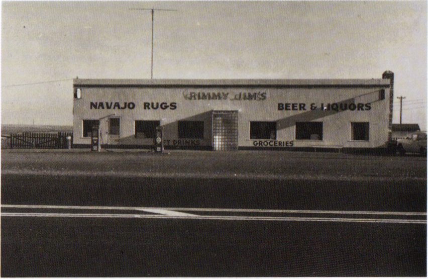
Late-19th and early-20th-century vernacular architecture also occurs along Clinton Avenue east of
Piermont Avenue. Two to two-and-a-half-story three-bay by two-bay residences with front porches are located at 40, 44 and 50 Clinton Avenue. These residences provide a rich visual counterpoint to more high-style architecture along the road east of Piermont Avenue
. . . . ‒Allison S. Rachleff

We lived at number 50 ‒ not rich, not poor
It’s the 1950s and the family
secure in its colonial Protestant identity
linked to Presidents
(though not all are the good ones)
lives on a street of mixed ethnicity
where children play baseball in the street
and all the parents rush out of their houses
to break up the fights
and the children do not date
once the baseball games conclude
but rather
seek their own kind
at separate lunchroom tables
and the father comes home from the ecumenical
breakfast at the synagogue and says
“I had the most curious roll this morning
It’s called a bagel and it was tasty.”

4

Jeanne Wolf safe in America died of consumption
in 1883 at 44 in New Bedford, Massachusetts
her husband died at 45 in 1889 in Philadelphia
their two sons also dead before their 40th birthdays
one dying mysteriously in New Orleans,
the other of consumption in Oran, Algeria.

(This we knew. This we surmised.)

5

A nephew long lost to us was found
in Colorado with DNA. He wrote,
“I am curious about what appears
to be our Sephardic Jewish roots.
Was Grandpa’s mother Jewish?”

armed with dictionary
devoid of idiom or grace
the birth certificate gave up its dates
its names
its towns
and occupations

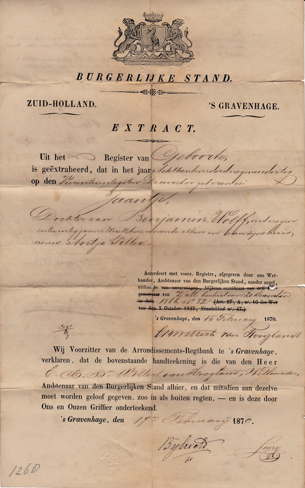
                From the Register of Births
                is extracted that in the year 1839
                on the twenty-fourth of December was born
                Jeanne

                Daughter to Benjamin Wolff, 29 years old
                shopkeeper resident here [Zuid-Holland, Gravenhage]
                with his housewife, Antje Pillar”

and a cousin we’d never met
from Brooklyn and Massachusetts
found our Dutch family group

All living in 1942
all dead in Poland by 1944

(Our Mayflower descendant’s note
“cheap tradesmen” ‒ code for Jew)

Betje Piller, an aunt, age 86
Alice Blitz, her grandchild and our cousin, age 20
an entire family line erased
Sobibor, Auschwitz

Relatives we did not know
captured, killed
in a family where ‒
safe across the ocean ‒
my memory of World War 2
was falling down a wooden staircase
bouncing on the landing
turning, sprawling
howling in the dark
of an air raid drill at night

Uncles sent off to war returned
(a cousin did not ‒ a rare
long-distance phone call
sticks in my mind ‒ distress)

brown paper
crisply folded into a striped brown bag that held
the birth certificates and a promissory note
left for us to preserve our past
footstep to the future
leading to the day
when “they”
became “us”


Martha Deed October 12, 2016


References:

Allison S. Rachleff. South Nyack [New York] Historic District. October 2005, Revised 2011.

https://www.erfgoedleiden.nl/collecties/personen/zoek-op-personen/weergave/akte/id/ab091c0b-bad6-83c5-8789-a91581b8b68c

Two Photos

This is a photo of me when I was about 25. It was taken by my good friend Pat Dagler, a wonderful photographer who died very young from a horrible illness. She was a black woman with enormous charm, passion and deep personal/political commitments. I loved her dearly. I don’t know what has happened to her amazing collection of photos.

I remember very vividly when this photo was taken. It was during a softball game in Central Park in 1969. That’s a baseball glove on my lap and I think I am eating a flower. What struck me most about the photo when I first saw it was how sexy and alive I looked, at least to myself, when in actuality I felt worn out and beyond depressed when it was taken. I had hit rock bottom.

Pat gave me two other photos she took that day. One was of my girlfriend Charlotte Hastings. Her face glowing with a smile that lit up the universe. The other photo was of me and Charlotte embracing, with my closest friend Arnie Sachar walking on a small hill in the background carrying his briefcase. The game was organized by another friend, Peter Wolff. All are dead now.

This second photo was taken about eight years ago when I was in my mid 60s. The great photographer George Malave asked if he could come over to photograph me. It was for a project he was working on. For the next couple of hours he shot me from various angles and from various locations in my apartment. Nothing came out right. I sensed his frustration. But maybe it was more mine than his. I hated how I looked in every one of the photos he took. Something drastic needed to be done. Suddenly I flashed on my downstairs neighbor, a strikingly beautiful, very thin, very dark woman from Zimbabwe. Someone in her late 20s or early 30s with real flair and charisma. Imagining myself being her, I put on a wide brimmed black hat that had a small red heart pinned on it and sat on a chair in the hallway. The very next photo was the one that he would use. Most striking to me was that I looked much, much younger than I had in any of the other photos. So much so I was embarrassed that people would think the photo had been touched up. Still, I seriously doubt anyone looking at it would see a breathtaking Zimbabwean beauty. But that is exactly who I see whenever I look at it.

Robert Roth

BHS sign

BHS storefront and signage Oxford Street, London, UK (2016)

Brands developed in market society (the term capitalism is far superior), attempting to distinguish essentially very similar commodities from each other by imbuing them with symbolism and all manner of social connotations. Some now genuinely believe the work involved in this process creates all value and that the labour involved in producing things in contemporary society is marginal. 

According to Marx (1990) the objects of our labour, the things we make, become commodities under capitalist social relations. As things which were made by workers to be sold on markets, not directly consumed by them, they can develop an unhealthy fascination for us. Rather than seeing these products as evidence of our social and creative labour power and the range of uses which can be met by what we make, commodities can come to dominate us. They seem in themselves capable of transforming our lives. This was what Marx meant by commodity fetishism

A lot of current theory argues we are now dominated not just by the commodity but by commodity signs. But when a brand collapses it becomes clear that brands as signs are socially worthless, mere empty shells. The value of BHS never resided in its semiotics or symbolic reach. Instead, like Woolworths before it, its value lay above all in the organisation of productive collective human labour. It was this which brought the store to life, filling its shelves with a range of familiar goods from sweets to clothes and furnishings.  

But take the workers out of the equation whether in the shop itself or in its supply chain or in the factories that made the goods on its shelves and what is left is nothing but an absent presence – a numbing sense of what was before but is no more. Dead brands/empty stores like BHS expose the madness of markets, the greed of capitalists and the emptiness of theory which discounts the centrality of social productive labour to all our lives. 

So when I look on this image of the now empty BHS storefront in Oxford Street it brings to mind something which Marx wrote with great prescience about the power of our collective social labour.
‘The wealth of societies in which the capitalist mode of production prevails appears as an immense collection of commodities is nothing but the definite social relation between people themselves assuming for them, the fantastic form of a relation between things.’ (Marx, 1990: 165)

Tony Sullivan

Reference

Marx, K. (1990 [1867]) Capital Volume One, London: Penguin.

A photo by Michael Wolf

From Tokyo Compression by Michael Wolf (2010)

I have chosen one image from a series of photographs by Michael Wolf.

The first thing that struck me when I first saw this image was the presence of intense pain, struggle and suffering of the subject staring out at us from behind the glass.

We view the portrait through a filter of water droplets which are on the inside of the space which the focus of the image occupies. We do not know the nature of this space but the presence of the moisture is suggestive of a humid, oppressive environment calling our attention to the discomfort of the subject. This then leads us to believe that she is being kept in harsh conditions, perhaps even against her will. The backdrop is dark, implying an unhappy, unsafe location and indeed, the subject looks troubled.

Michael Wolf began his career as a photojournalist and the reason I have revisited this image from his series Tokyo Compression, is because I have been reminded of it in recent years. There have been many ‘similar’ images in the media in the reporting of the desperate plight of the Syrian refugees, all of whom are trying simply to escape danger and keep themselves and their families safe.

The photograph that I have chosen here is not that of an individual from a war torn community or of a desperately frightened refugee fleeing danger, but an image from a series of portraits of city workers on their daily commute on the subway in Tokyo. The subjects of these photographs, which I find compelling, are certainly likely to be suffering; that is of course by today’s standards of those of us living a relatively mundane, but almost certainly a safe life. The anguish felt is that of the everyday grind of the chore of the monotonous repetitiveness of going to work to pay the bills.

I can’t help but observe how this image presents a somewhat over dramatic alternative to the actual reality, in the same way as what often currently happens on social media. Perhaps, though, this has more to do with the viewer and how we are conditioned by the copious amounts of shocking images we are flooded with in our news feeds and timelines today.

Sam Humphreys

A work by Félix González-Torres


Félix González-Torres “Untitled” (Perfect Lovers) 1991

A white painted wall. Mounted on it, two identical clocks positioned side by side. They are ordinary, ‘every-day’ clocks that could be purchased anywhere. There is nothing ‘pretty’ or special about them, they are just functional. The clocks keep exactly the same time and as we watch, we see time ticking away in front of us. Perhaps, we are watching our lives passing us by, our time here slowly running away and there is nothing that can be done to stop it.
But, there are two clocks and they are positioned closely together, so perhaps this coupling represents a real connection, signifying a relationship between them both. This can all be surmised by just looking at the piece but then we notice the title, “Untitled” (Perfect Lovers). The clocks then, represent two lovers.
Now, the ticking of the clocks feels like the beating of two hearts. Each clock is a very separate entity, but although they are two very separate beings they are completely in ‘sync’ with each other. They are connected so thoroughly that their hearts beat together as if they were just one being, they are in love. The two clocks are placed as closely together as possible whilst still remaining individual objects , but also, they are too close to allow anything to come between them.
The complete functionality and ordinariness of the clocks now begins to appear differently. Love between two people, whether it be a partner, a parent and child or between two friends is available to everybody. Love is special, a gift, but you don’t have to be out of the ordinary or ‘special’ to receive or experience love. Love creates bonds between people that can’t easily be broken. Of course, as we look at the two clocks we must face the knowledge that it is unlikely the clocks will both stop at the same time. One day, one of them will stop completely, leaving the other to go on ticking alone.
Félix González-Torres created this piece after the death of his partner from AIDS in 1991. He wanted to create work that both allowed him to share this very personal experience but keep it from being vilified because of his homosexuality.
He writes,
‘Two clocks side by side are much more threatening to the powers that be than an image of two guys sucking each others dicks, because they cannot use me as a rallying point in their battle to erase meaning.’
With this piece González-Torres shows us a beautiful tribute to the concept of love. He has removed all the unkindness and judgement of human nature, stripping away the pettiness of life, that we are all guilty of, and showing us instead the essence of love in its absolute purity.

Shelly Crowley

John Baldessari – The Pencil Story

John BaldessariThe Pencil Story (1972–3)
[Colour photographs, with coloured pencil, mounted on board]

The work comprises two photographs of what we are told is the same pencil, side by side, before and after being sharpened. Underneath the photos, hand written in white ink directly onto the black paper that they are mounted on, is a short text about Baldessari’s relationship with the pencil.

The work’s composition suggests a ‘scrap book’ style, the photos aren’t uniform, they don’t appear straight, the text is hand written and all in capital letters.

There’s something about the writing, though, that doesn’t feel as authentically scrap book as a first glance suggests. Although the style of the text seems like a quick note it differs from genuine rough note style in that the text is very neat. The lettering is clear, and the letter shapes are rather consistent. Each sentence is roughly the same length, suggesting that the time and planning were involved.

The text reads:

“I HAD THIS OLD PENCIL ON THE DASHBOARD OF MY CAR FOR A LONG TIME. EVERY TIME I SAW IT, I FELT UNCOMFORTABLE SINCE ITS POINT WAS SO DULL AND DIRTY. I ALWAYS INTENDED TO SHARPEN IT AND FINALLY I COULDN’T BEAR IT ANY LONGER AND DID SHARPEN IT. I’M NOT SURE, BUT I THINK THAT THIS HAS SOMETHING TO DO WITH ART.”
 

The text records the performance between the taking of the two images.

The pencils in the photos face lead-point down, and although the edges of the photos are not mounted straight, the pencils in each are straight in relation to the black mounting. The point of each pencil is exactly the same length from the bottom border and both in the same placement slightly closer to the left photo.

The photos illustrate the story. The pencil on the left is un-sharpened with a ‘dull and dirty’ point, the image on the right shows the newly sharpened pencil with a clean sharp lead.

There is a balance, careful placement of each component creating a visual that to the eye looks a little like a page from a sketch book but following careful and time tested rules of composition.  Baldessari gives the viewer all the visual clues to read this as a quick sketchbook-style page, creating a very authentic story, the story ending “I’M NOT SURE, BUT I THINK THIS HAS SOMETHING TO DO WITH ART” further suggesting to the viewer that this wasn’t intended as a finished work of art to be viewed in a gallery.

This piece literally questions itself and creates an interesting parallel to the ideas behind the ‘readymade’ and the authority of the ‘artist’ and the gallery.

Here is a piece I recreated as a post to social media site Instagram in response to this work.

Liz Sterry

A Photo by Ed Ruscha

Ed RuschaRimmy Jim’s Chevron, Rimmy Jim’s, Arizona 1962 from 26 Gasoline Stations

Time and again in discussions of Ed Ruscha’s photographic work one comes across (in addition to its usual stowing in a box labelled ‘conceptual’) expressions like deadpan, boring, amateur, flat, affectless. In Jeff Wall’s much vaunted article Marks of Indifference (which, I’m sure not intentionally, has helped pave the way for the legitimisation of a species of art photography which seems to be based on cost of making and yardage) he rather snottily talks of how amusingly bad the images of one of Ruscha’s early photo series are:

“…the majority seem to take pleasure in a rigorous display of generic lapses: improper relation of lenses to subject distances, insensitivity to time of day and quality of light, excessively functional cropping, with abrupt excisions of peripheral objects, lack of attention to the specific character of the moment being depicted – all in all a hilarious performance, an almost sinister mimicry of the way “people” make images of the dwellings in which they are involved …”

In a sort of reply to this, I’ll confine myself to a single image from the series, entitled, rather splendidly, Rimmy Jim’s Chevron, Rimmy Jim’s, Arizona 1962.

It is a wonderful study in horizontal lines and a kind of poetic deviation therefrom. The white lines on the road in the foreground, the change of texture marking the threshold of the garage forecourt, the blockhouse type building itself and the neat tops and bottoms of windows, porch, petrol pumps, litter bin and what appears to be a bench; and the lines of text (and there’s an obvious but nonetheless real frisson to be had here in light of Ruscha’s later work.) The three cross bars of aerials or telegraph poles, one atop the building in the middle left foreground and two lovely and delicate echoes in the far right middle ground and just visible at far left, way back in the distance. The horizon at far left and the roof of the outbuilding, then, bridging the gap between horizontality and something else—the ‘serrated’ top edges of the gates at both ends.
And in a kind of visual counterpoint, those angled lines—the telegraph wires rising up and out at right and the single cable leading downwards at left. More pronounced, the long morning (or evening) shadows across the main building and the thick short white diagonal connecting the two road lines.

A diagonal extrudes into the z-axis with the car parked outwards towards the road, with the photo’s unique curve (if one excludes the hardly discernible, perhaps imagined, one of the litter bin), the arc of the car roof.

Finally—it seems to me that the whole photo tilts slightly to the right. Whereas some might find evidence here of incompetence, bad photography, I choose to
(I’m not even sure I choose to, I simply do; something in my formation, my time and place, disposes me to this) receive this as rescuing the photo from over-schematicism. The tilt both reminds us of human agency at work and contributes to the stew of formal interest around line.
I choose to find it not bad but human. I choose to find it an element of a new kind of good and I choose to argue that point, to make it part of a discussion in the world about images, art in general and what it is and what it does.

Michael Szpakowski